Gradients
This Swift code defines a simple user interface (UI) using SwiftUI, Apple’s declarative UI framework. Let’s break down what each part is doing:
Comments:
//
//  ContentView.swift
//  forms
//
//  Created by Dre on 02/05/2025.
//
These lines are comments. They provide information about the file: its name (ContentView.swift), the project it belongs to (forms), the creator (Dre), and the creation date (May 2nd, 2025). These are ignored by the Swift compiler.
Import Statement:
import SwiftUI
This line imports the SwiftUI framework. This framework provides all the necessary tools and building blocks for creating user interfaces in a declarative way.
ContentView Struct:
struct ContentView: View {
    // ... content ...
}
This declares a structure named ContentView. In SwiftUI, the UI is typically built using structures that conform to the View protocol. This protocol requires the structure to have a body property that describes the view’s content and layout.
State Variable:
@State private var animateGradient: Bool = false
@State: This is a property wrapper that allows SwiftUI to manage the state of the view. When a@Statevariable changes, SwiftUI automatically re-renders the parts of the view that depend on that variable.private: This access modifier means that theanimateGradientvariable can only be accessed and modified within theContentViewstruct.var animateGradient: Bool = false: This declares a variable namedanimateGradientof typeBool(Boolean), and it’s initialized tofalse. This variable will be used to control the animation of the background gradient.
Color Constants:
private let startColor: Color = .blue
private let endColor: Color = .green
These lines declare two private constants, startColor and endColor, of type Color. They are initialized to the built-in SwiftUI colors blue and green, respectively. These will be used to define the gradient’s colors.
body Property:
var body: some View {
    // ... UI elements ...
}
This is the essential part of the ContentView. It’s a computed property that returns the description of the view’s UI hierarchy.
VStack:
VStack(spacing: 20) {
    // ... elements arranged vertically ...
}
VStack: This is a container view that arranges its child views in a vertical line.spacing: 20: This specifies that there should be a spacing of 20 points between the elements within theVStack.
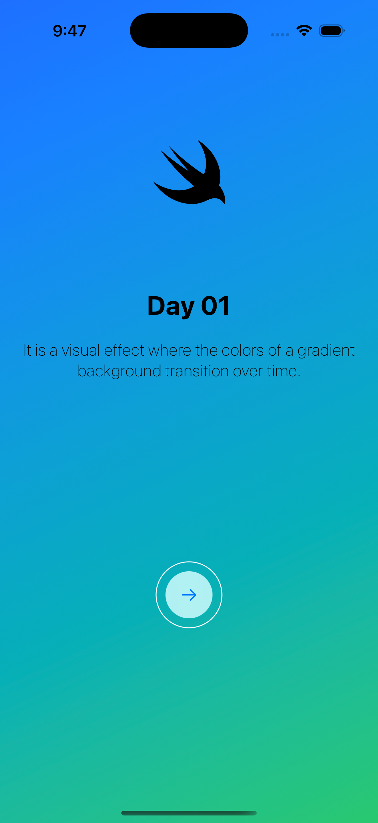
Image:
Image(systemName: "swift")
    .font(.system(size: 72, weight: .light))
    .padding(.top, 80)
    .padding(.bottom, 64)
Image(systemName: "swift"): This creates an image using a system-provided icon."swift"is the name of an SF Symbol (a library of consistent, vector-based symbols provided by Apple). It will display the Swift logo..font(.system(size: 72, weight: .light)): This sets the font of the image. It uses the system font with a size of 72 points and a light weight..padding(.top, 80)and.padding(.bottom, 64): These add padding (empty space) of 80 points at the top and 64 points at the bottom of the image.
Text (First):
Text("Day 01")
    .font(.title)
    .bold()
Text("Day 01"): This creates a text view displaying the string “Day 01”..font(.title): This sets the font of the text to the predefined “title” style, which is typically larger and bolder..bold(): This makes the text bold.
Text (Second):
Text("It is a visual effect where the colors of a gradient background transition over time.")
    .fontWeight(.thin)
Text(...): This creates another text view displaying the provided description..fontWeight(.thin): This sets the font weight of the text to “thin”.
Spacer():
Spacer()
This creates a flexible space that expands to fill the available space in its parent container. In this VStack, the first Spacer() pushes the elements above it towards the top, and the second Spacer() pushes the button towards the bottom.
Button:
Button {

} label: {
    Image(systemName: "arrow.right")
}
.frame(width: 50, height: 50)
.background(Color.white)
.cornerRadius(25)
.padding(10)
.overlay {
    Circle()
        .stroke(style: StrokeStyle(lineWidth: 1))
        .foregroundColor(.white)
}
Button { ... } label: { ... }: This creates a button.- The empty curly braces
{}define the action to be performed when the button is tapped. In this case, there’s no action defined yet. - The
label:closure defines the visual content of the button. Here, it’s anImagewith the system icon “arrow.right”.
- The empty curly braces
.frame(width: 50, height: 50): This sets the fixed width and height of the button to 50 points..background(Color.white): This sets the background color of the button to white..cornerRadius(25): This rounds the corners of the button with a radius of 25 points, making it a circle..padding(10): This adds a padding of 10 points around the button..overlay { ... }: This places another view on top of the button.Circle(): This creates a circle shape..stroke(style: StrokeStyle(lineWidth: 1)): This applies a stroke (an outline) to the circle with a line width of 1 point..foregroundColor(.white): This sets the color of the stroke to white. This creates a white border around the circular button.
Modifiers applied to the VStack:
.frame(maxWidth: .infinity)
.padding(.horizontal)
.multilineTextAlignment(.center)
.frame(maxWidth: .infinity): This makes theVStackexpand to take up the entire available width of its parent container..padding(.horizontal): This adds some default horizontal padding to the content within theVStackon both the left and right sides..multilineTextAlignment(.center): This aligns the text within theVStackto the center, especially if the text spans multiple lines.
background Modifier:
.background {
    LinearGradient(colors: [startColor, endColor], startPoint: .topLeading, endPoint: .bottomTrailing)
        .edgesIgnoringSafeArea(.all)
        .hueRotation(.degrees(animateGradient ? 45 : 0))
        .onAppear {
            withAnimation(.easeInOut(duration: 3).repeatForever(autoreverses: true)) {
                animateGradient.toggle()
            }
        }
}
This sets the background of the entire VStack.
LinearGradient(colors: [startColor, endColor], startPoint: .topLeading, endPoint: .bottomTrailing): This creates a linear gradient that transitions fromstartColor(blue) toendColor(green). The gradient starts from the top-leading corner and ends at the bottom-trailing corner..edgesIgnoringSafeArea(.all): This makes the background gradient extend to the edges of the screen, even into the safe areas (areas that might be obscured by the device’s notch or status bar)..hueRotation(.degrees(animateGradient ? 45 : 0)): This applies a hue rotation effect to the gradient.animateGradient ? 45 : 0: This is a ternary conditional operator. IfanimateGradientistrue, the hue will be rotated by 45 degrees; otherwise, it will be 0 degrees (no rotation).
.onAppear { ... }: This closure is executed once the view appears on the screen.withAnimation(.easeInOut(duration: 3).repeatForever(autoreverses: true)) { ... }: This creates an animation block..easeInOut(duration: 3): This specifies an animation that starts slowly, accelerates in the middle, and then decelerates at the end, with a total duration of 3 seconds..repeatForever(autoreverses: true): This makes the animation repeat indefinitely, and when it reaches the end, it reverses its direction.animateGradient.toggle(): This line inside the animation block toggles the value of theanimateGradientvariable betweentrueandfalse. This change inanimateGradienttriggers the.hueRotationmodifier to update, creating the animated color shift in the gradient.
#Preview:
#Preview {
    ContentView()
}
Here is the code for reference, Github Gist
This is a special construct in Xcode that allows you to see a live preview of your UI within the Xcode canvas without having to run the entire app on a simulator or device. It instantiates an instance of ContentView for the preview.
In Summary:
This Swift/SwiftUI code creates a simple screen with:
- A Swift logo at the top.
- The text “Day 01” as a title.
- A descriptive text about animated gradients.
- A circular button with a right arrow icon at the bottom.
- A dynamic background gradient that smoothly cycles through different hues of blue and green due to the animation applied to the
hueRotation. The animation starts when the view appears and repeats indefinitely.
Did I make a mistake? Please consider Send Email With Subject