Visualize an Nginx Log
1. The Frustration
I set out to sharpen my Jupyter skills with a hands on project: analyzing Nginx access logs. The goal was simple, parse the raw data, visualize traffic patterns, and spot issues like errors or hot paths. But I craved better visualizations for plotting trends and stats, something more interactive than static Jupyter plots. That’s why I turned to Streamlit, its visualization components promised quick, dynamic dashboards without the hassle of full web dev.
Raw logs are a mess: inconsistent formats, massive files that choke your memory, and timestamps begging for proper parsing. My first attempts in Jupyter yielded garbled data frames and basic matplotlib charts that felt flat. Streamlit’s components shone here, but integrating them meant iterating on data prep to feed clean inputs. It was a reminder that real-world data doesn’t play nice, even for ‘practice’ projects aiming for polished viz.
2. What I Tried
I started in a Jupyter notebook, experimenting with regex for parsing and pandas for cleaning. Once I had a solid prototype with basic plots, I migrated to scripts for the app, leveraging Streamlit’s built-in visualization components to elevate the stats and charts.
Here’s the core of the parsing script, unchanged but crucial for feeding data to those viz tools:
import pandas as pd
import re

log_pattern = r'(\S+) - - \[(.*?)\] "(.*?)" (\d+) (\d+) "(.*?)" "(.*?)"'

def parse_line(line):
    match = re.match(log_pattern, line)
    if match:
        return {
            'ip': match.group(1),
            'timestamp': match.group(2),
            'request': match.group(3),
            'status': int(match.group(4)),
            'bytes_sent': int(match.group(5)),
            'referer': match.group(6),
            'user_agent': match.group(7)
        }
    return None

with open('access.log', 'r') as f:
    data = [parse_line(line) for line in f if parse_line(line)]

df = pd.DataFrame(data)
df['timestamp'] = pd.to_datetime(df['timestamp'], format='%d/%b/%Y:%H:%M:%S %z')
df.to_csv('access.csv', index=False)
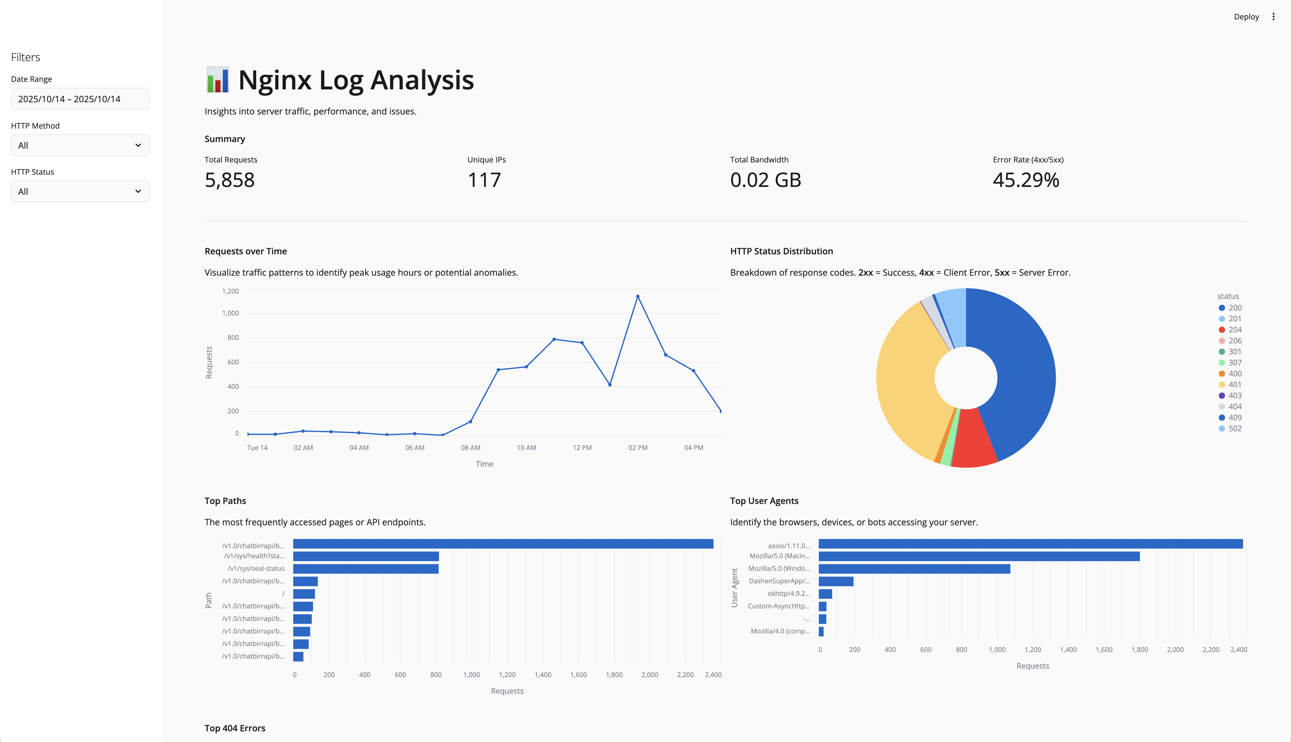
Then, in the Streamlit app (nginx_app.py), I loaded the CSV and dove into its visualization arsenal. Streamlit makes plotting and stats a breeze with native components like st.metric for key stats (e.g., total requests, error rates), st.line_chart or st.area_chart for time-series data like requests over time, and st.bar_chart for distributions such as top paths or status codes. For more advanced, interactive viz, I integrated Altair via st.altair_chart, which supports zooming, tooltips, and custom themes, perfect for exploring hourly traffic or user agent breakdowns.
It also has st.plotly_chart for 3D plots or maps if needed, and st.pydeck_chart for geospatial data (handy if I add IP location later). Even simple elements like st.dataframe or st.table display raw data interactively, with sorting and pagination. These components update in real-time with filters, making the dashboard feel alive.
Here’s a snippet showing filters, metrics, and a couple of viz:
import streamlit as st
import pandas as pd
import altair as alt

df = pd.read_csv('access.csv')
df['timestamp'] = pd.to_datetime(df['timestamp'])

# Sidebar filters
st.sidebar.header('Filters')
date_range = st.sidebar.date_input('Date Range', (df['timestamp'].min().date(), df['timestamp'].max().date()))
methods = st.sidebar.multiselect('HTTP Methods', df['request'].str.split().str[0].unique())
statuses = st.sidebar.multiselect('Status Codes', df['status'].unique())

# Filter data
filtered_df = df[(df['timestamp'].dt.date >= date_range[0]) & (df['timestamp'].dt.date <= date_range[1])]
if methods:
    filtered_df = filtered_df[filtered_df['request'].str.split().str[0].isin(methods)]
if statuses:
    filtered_df = filtered_df[filtered_df['status'].isin(statuses)]

# Overview metrics with st.metric
st.header('Traffic Overview')
col1, col2, col3, col4 = st.columns(4)
col1.metric('Total Requests', len(filtered_df))
col2.metric('Unique IPs', filtered_df['ip'].nunique())
col3.metric('Total Bandwidth (MB)', round(filtered_df['bytes_sent'].sum() / 1e6, 2))
col4.metric('Error Rate (%)', round(100 * len(filtered_df[filtered_df['status'] >= 400]) / len(filtered_df), 2))

# Time-series with st.altair_chart
st.header('Requests Over Time')
hourly = filtered_df.resample('H', on='timestamp').size().reset_index(name='requests')
chart = alt.Chart(hourly).mark_line().encode(x='timestamp:T', y='requests:Q').interactive()
st.altair_chart(chart, use_container_width=True)

# Status distribution with st.bar_chart
st.header('Status Code Distribution')
status_counts = filtered_df['status'].value_counts().reset_index()
st.bar_chart(status_counts.set_index('status'))
It ran smoothly, but optimizing for large logs meant chunking reads and smarter queries, lessons straight from notebook iterations. Streamlit’s components handled the heavy lifting for viz, turning static stats into engaging, filter responsive elements.
3. The Mental Model
This project drilled home a key insight: Jupyter is your playground for data exploration, where you prototype parsers and basic plots. But for better visualization in plotting and stats, Streamlit’s components bridge the gap to interactive apps effortlessly. No need for JavaScript or complex frameworks, just Python code that renders charts, metrics, and tables with built-in interactivity.
The parsing and querying logic sets a strong foundation for handling data, making it easier to build on for more advanced features down the line.
4. What’s Next
I’ll expand this maybe add real time log streaming, geoIP mapping with st.pydeck_chart, or more advanced stats like heatmaps via st.heatmap (though that’s more for correlations). If you’ve got ideas for log analysis tools or Streamlit extensions for even fancier viz, hit me up.
For now, it’s a solid base. Jupyter practice achieved, and the dashboard’s up and running with those killer visualization features.
5. Takeaway
Data projects start messy, but iterative prototyping in Jupyter turns chaos into clarity, and Streamlit’s visualization components from simple metrics and bar charts to advanced Altair integrations, make your insights pop. Don’t skip the notebook phase, it’s where insights emerge. And remember, today’s basics are tomorrow’s project expansions.
Done with Day 1.
Did I make a mistake? Please consider Send Email With Subject